A package to create sector charts easily using Cartesian coordinates.
R
ggplot2
Dataviz
Tidyverse
Author
Abdoul ISSA BIDA
Published
June 6, 2023
Welcome data folks. Today, we walk through a new grammar of graphics extension package.
Yeah, I know, you should be overwhelmed with all the ggplot2 package extensions out there, but I promise this one, like all the others, comes with its own set of features, so you won’t be disappointed.
Motivation
For my short experience (3-4 years) with the {tidyverse} ecosystem, and particularly with the grammar of graphics philosophy, I was surprised that there was no native function for making sector charts, de facto using Cartesian coordinates.
There were methods to derive bar charts to sectors one, using polar coordinates, I’ve applied them a lot in the past, but usually ended up frustated to not be able to easily add labels to the plot using the Catersian system, in which I best project myself.
So, a few months ago, I decided to create a package to fix this problem. If sectors charts rhyme with pie and donut charts, it is a kind a chart not used enough in my opinion, which pushed me to immerse myself in the package, the series of circles chart.
geom_series_circles
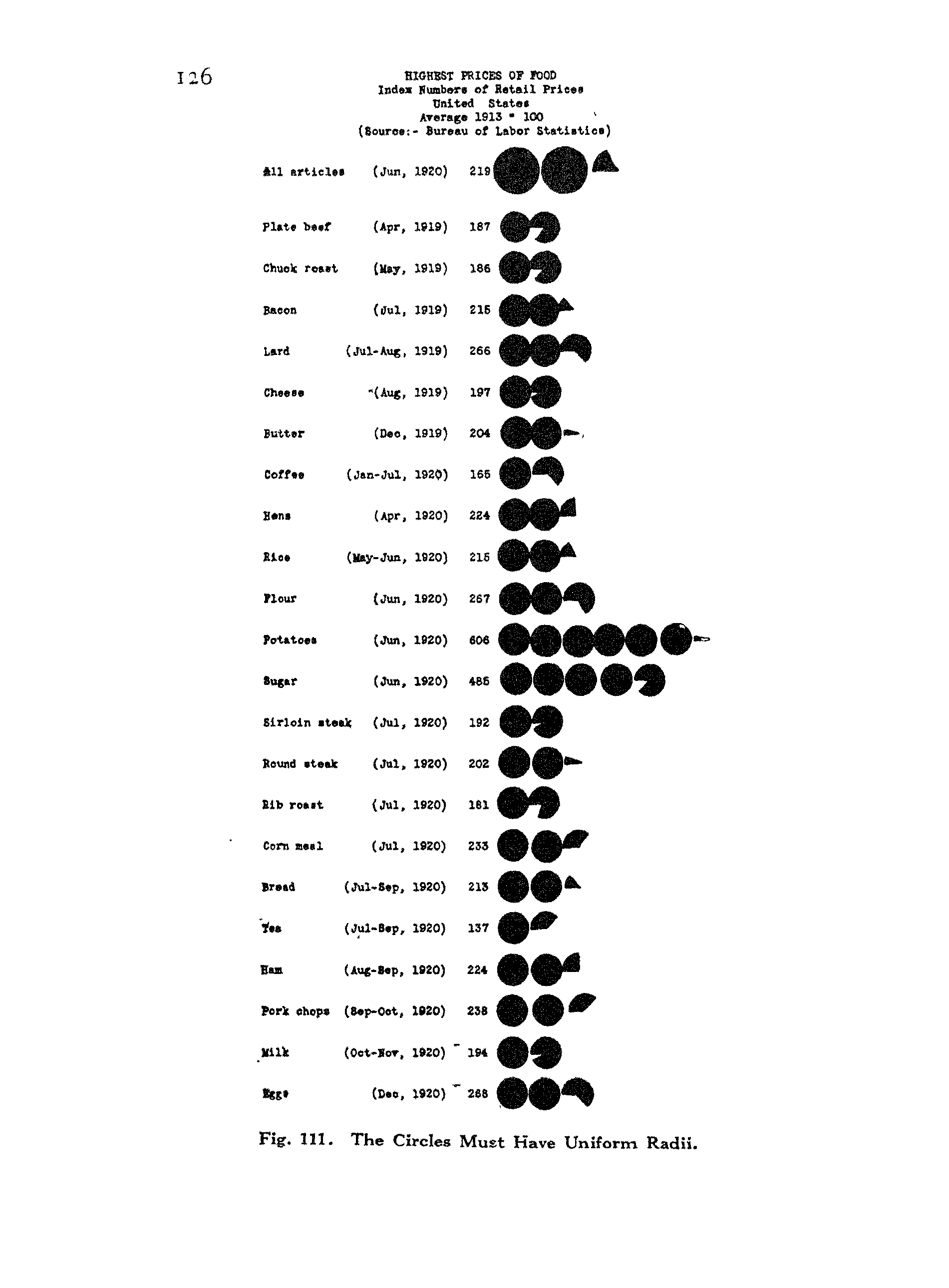
I like books. I like old style. And I like data visualization. So, you won’t be surprised that I usually find myself stuck with data visualization books from the early 1900s. That’s how, I was drawn to this chart featured in Charts and Graphs by Karl G. Karslen.
CHARTS AND GRAPHS, Karl G. Karsten, Page 126
According to the book:
It consists in using whole circles and fractions of fragments of circles, all of uniform radii.
This type of chart can be a good alternative for presenting information in the form of a bar chart, or financial or proportional data, in which the circle can be taken to represent dollars (or something) and the fractions of circles parts of dollars (or parts of something). I decide to call the function drawing this kind of chart geom_series_circles.
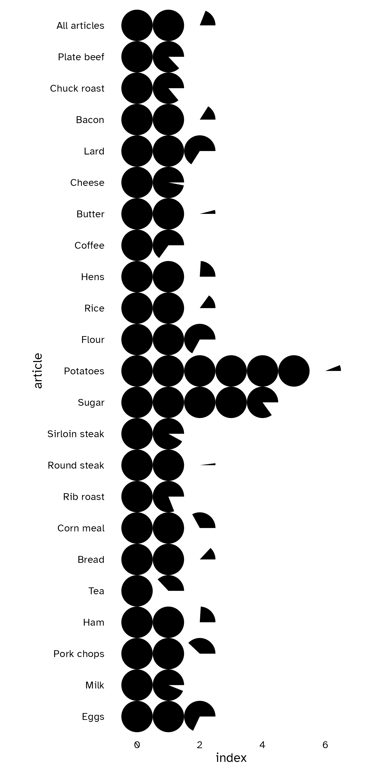
Let’s use the example data below to illustrate the use of the function.
theme_post <-function(...) {theme_minimal() +theme(text =element_text(family ="Atkinson Hyperlegible"),axis.text =element_text(color ="black"),panel.grid =element_blank(),plot.background =element_rect(fill ="white", color =NA), ... ) }prices_index |>mutate(article =fct_rev(fct_inorder(article)),# divide the index /100# to represent each 100 index by 1 circle# otherwise the result would not be visually pleasingindex = index /100 ) |>ggplot() +geom_series_circles(aes(# the indexes will represented horizontally# and articles vertically# Feel free to inverse x and y if you want the oppositex = index,y = article )) +coord_equal(clip ="off") +theme_post()
That’s it. We have our series of circles, where each complete circle represents 100 of food index, and each fragment of circle represents a value proportional to 100.
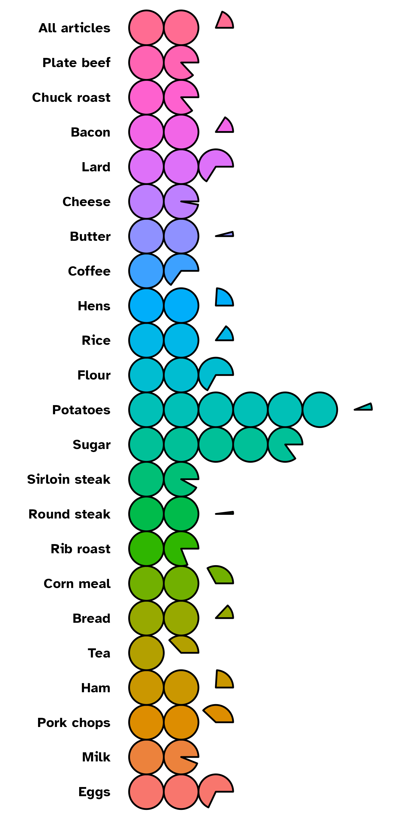
As {ggplot2} aficionados, I know you will ask for customization options. So I add a native fill argument in the aes() mapping function. You also have thecolor and linewidth option arguments to drive the color and width of circle borders respectively.
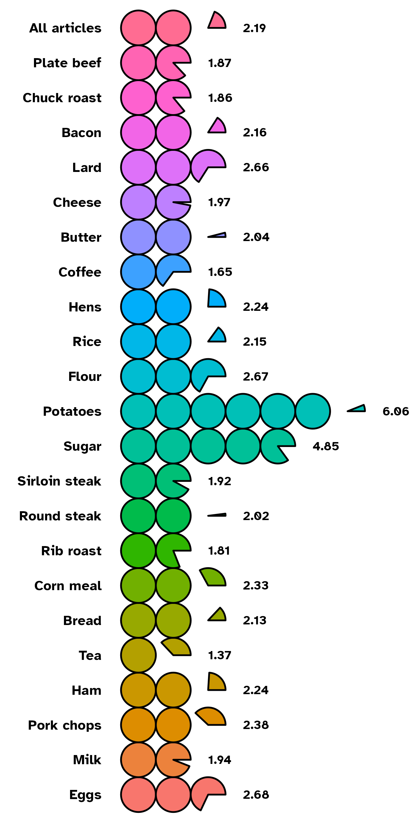
Of course, you can choose, to customize the categories labels by setting axis.text in theme_*() function. But the need may come to add labels at series of circles boundary positions. There comes geom_series_text() function. See it as a companion function to geom_series_circles().
For many more options (starting angle, circle radius … etc), for both functions, ?ggtricks::geom_series_circles and ?ggtricks::geom_series_text in your console will open the help window with documentations.
So it’s time to dive in creating more classic sector charts with ggtricks.
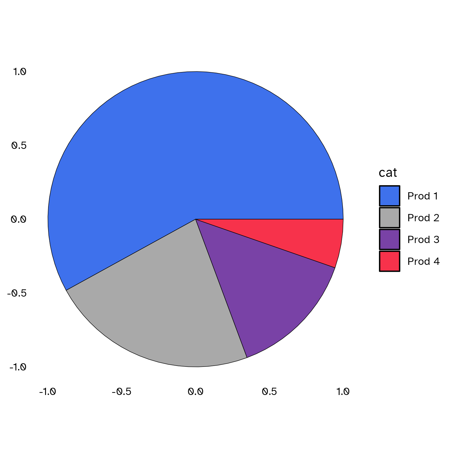
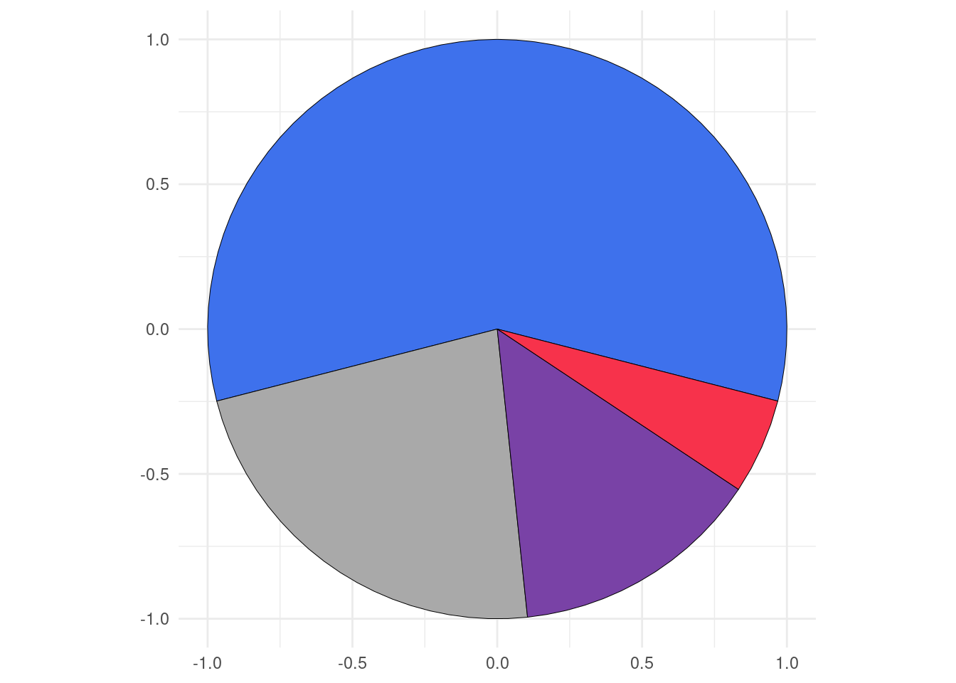
geom_pie
As mentioned, when starting this blog post, there had always been ways to create sector charts with ggplot2 using coord_polar with pros and cons when adding labels. So before deciding to implement the geom_pie function, I searched for possible solutions, but I didn’t find one that met my need (except the base R graphics pie function ). That’s where the package developer in me came in!
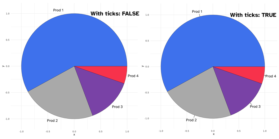
If you want the category with the max value to determine the slices positions, you can set the spotlight_max parameter to true. Then the category with the max value will be placed at spotlight_position (by default top, others possible values are: right, bottom and left.)
spotlight_cat
Maybe, you want a specific category to drive the slices positions rather than the category with the maximum value?
This is where comes the spotlight_cat parameter to define the driving category. Also here, you can combine the spotlight_cat parameter value with spotlight_position to specify its position.
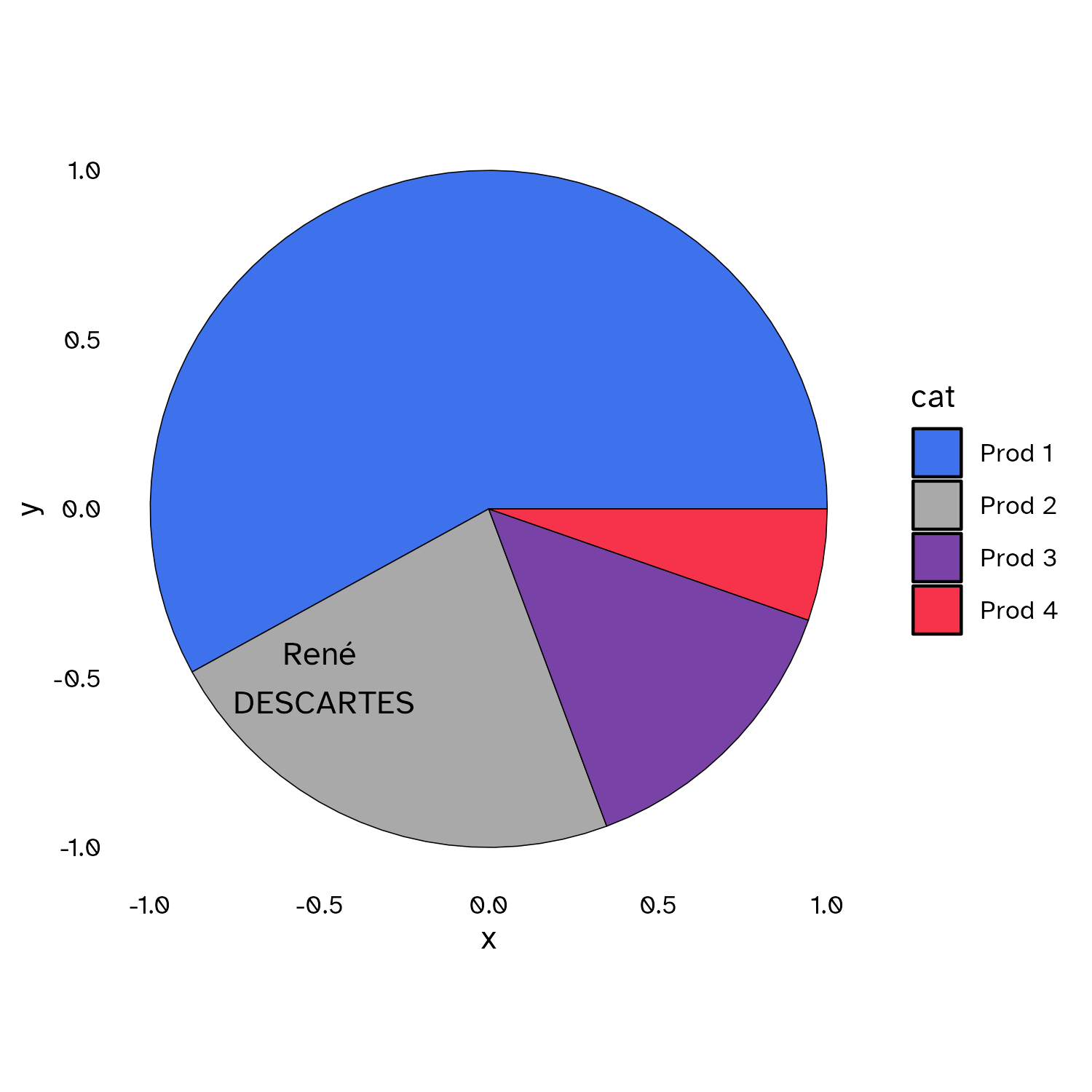
As I know that it can be difficult to know the coordinates of the center positions of the category slices, I define a default label mapping which will place the provided labels at this position. When label mapping is defined, you can set the labels_with_tick parameter to TRUE to add tick marks to the centers positions of the slices.
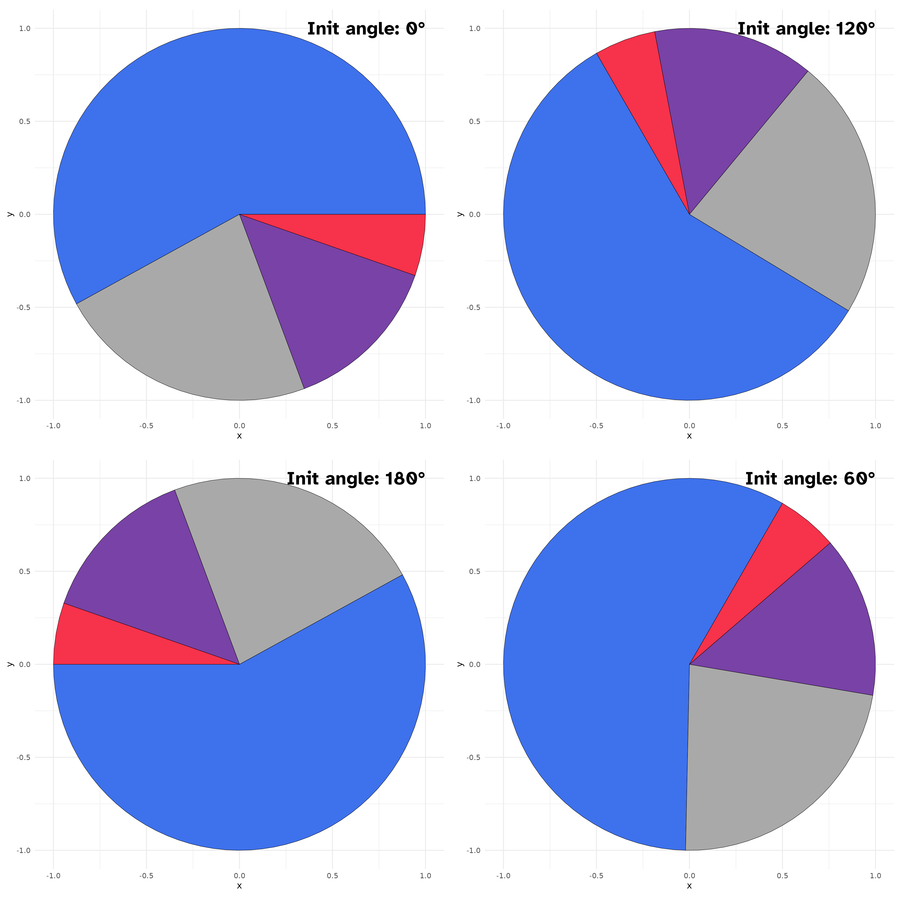
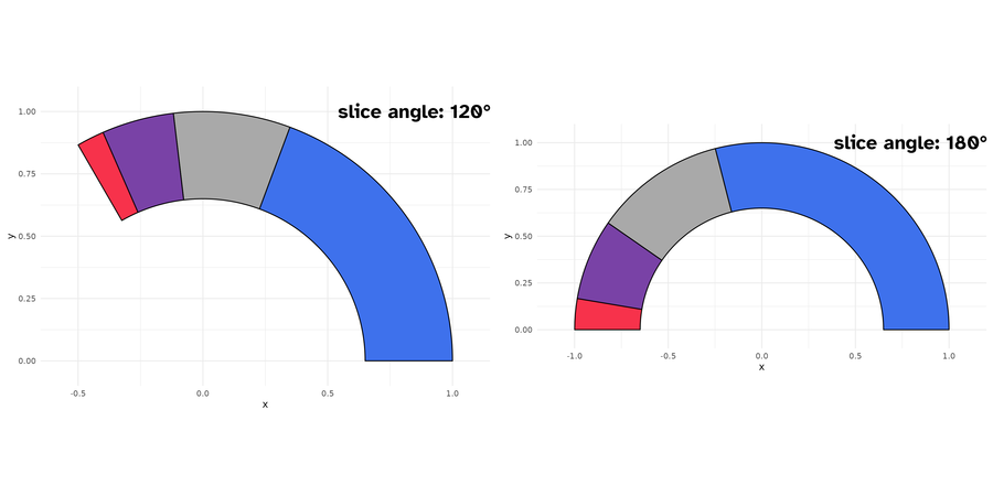
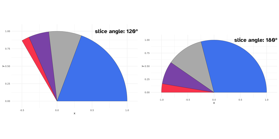
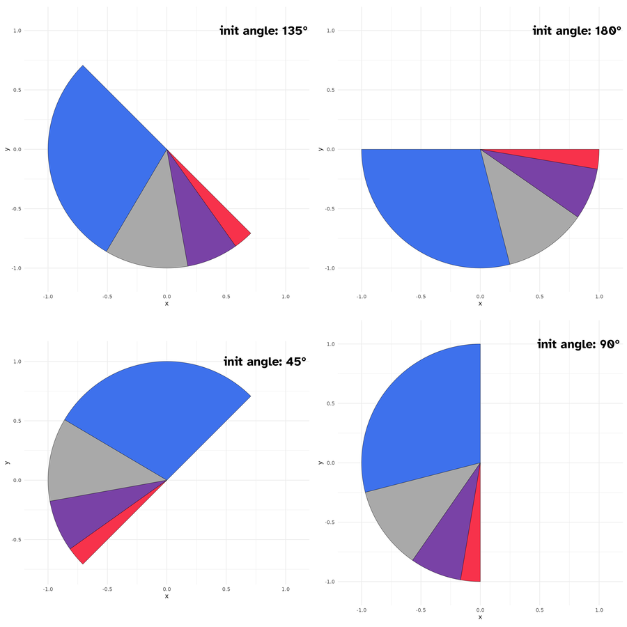
Also here, you can set the starting angle position with init_angle. Note here that there are no spotlight_max, spotlight_cat parameters, since we are not drawing a complete circle (but theoretically you can, if you set slice_angle to 360, which means a pie.)
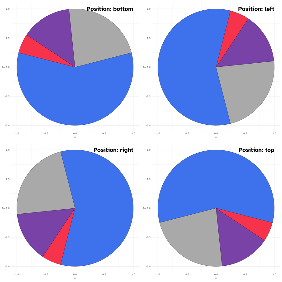
You can however set the slice position with slice_position (possible values are: top, right, bottom, and left). Soon, I will post more detailed examples on the package website: https://abdoulma.github.io/ggtricks/.
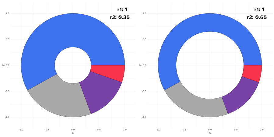
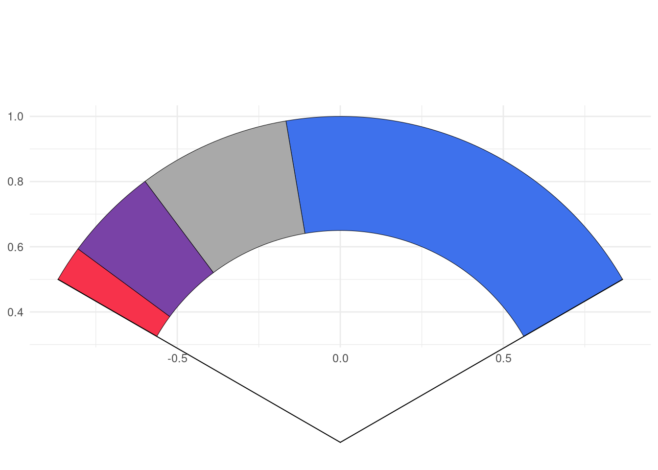
geom_donut_slice
It is a slice of donut plot. As a geom_donut, it is driven by 2 radii and as a slice plot, it has a defined slice angle.
As you might have noticed, to generate circle, I use coord_equal(), using coord_cartesian() will zoom the plot, not generating a appealing circle shape even if the underlying drawn plot is a circle. So, we fix, the aspect ratio to force :
the physical representation of data units on the axes.
according to the official documentation. Of course, you shouldn’t edit the default ratio = 1 that ensures that one unit on x-axis is the same length as one unit on the y-axis.
When using geom_series_circles(), the desire will come one day to combine it with facet_wrap() or facet_grid() or any faceting function, you should not, or not the way you envision.
Since we are using coord_equal(), you won’t be able to set scales parameter, which I strongly suspect you to try to do. So for the moment, I advise you not to do so. However, I will provide some tips to go through those restrictions on package website https://abdoulma.github.io/ggtricks/. If you have any specific questions or suggestions, do not hesitate to reach out to me.
Future improvements
In the coming weeks, additional features will be added to current geoms:
Detach spotlighted category
Variate radii for the representation of categories
Label displaying in mapping (choose categories we want to display)
Special key draw for pie and slice and another one for donut and donut_slice.
As announced at start, I am not limiting the package to sector charts, so additional geom styles will be added, and if you have suppositions, fee free to open an issue, I am open to all contributions.
Citation
BibTeX citation:
@online{issabida2023,
  author = {Abdoul ISSA BIDA},
  title = {Ggtricks},
  date = {2023-06-06},
  url = {https://www.abdoulblog.com},
  langid = {en}
}