library(tidyverse) # Import ggplot2 and friends for data wrangling Data Reading
For this first blog post, we are going to use Tidytuesday(Mock 2021) Week 34 Dataset.
The data comes from SpeechInteraction.org and was shared by Sara Stoudt.
It is the records of Star Trek characters interactions with Voice User Interfaces(VUIs) such as Apple Siri, Google Assistant, Amazon Alexa.
A complete description of the dataset is available at : https://github.com/rfordatascience/tidytuesday/tree/master/data/2021/2021-08-17.
First of all, let’s import tidyverse package :
Secondly, let’s read the data :
computer <- readr::read_csv('https://raw.githubusercontent.com/rfordatascience/tidytuesday/master/data/2021/2021-08-17/computer.csv')Here is what the data looks like.
head(computer, 2)knitr::kable(head(computer, 2), format = "html")Data Wrangling
We won’t spend a lot of time wrangling data to try to bring out some specific pattern. We are going to simply count the characters which interact the more with VUIs.
characters <- computer %>%
  count(char, sort= T) %>%
  # Categorize  the  characters that will be useful for our visualization
  mutate(char = factor(char))
Let’s look at, the 6 characters which interact the most with VUIs.
head(characters)| char | n |
|---|---|
| Computer Voice | 598 |
| Geordi | 320 |
| Picard | 266 |
| Data | 235 |
| Riker | 150 |
| Beverly | 121 |
The results are logical because Geordi is an engineer in The Star Trek Saga.
Graphic
For this section, we need to import some extra libraries:
- treemapify(Wilkins 2021)
- paletteer(file. 2021)
- ggtext
- ragg
library(treemapify) # For geom_treemap and friends
library(paletteer) # For color palette
library(ggtext) # For customize text (used in this script with element_markdown)
library(ragg) # For the device for save the plot
So why a Tree Map, instead of a Pie chart for proportions Visualization?
Pie charts are generally really cool to look at. But in some cases, like ours, there is too many individual data, and they are so close in magnitude that the message that we try to spread with a pie chart is biased.
In those cases, I use Tree Maps, which are pretty useful for the presentation of proportions.
characters %>%
  ggplot(aes(fill = char,area = n)) +
  geom_treemap(color = "black", size = 1) +
  # We won't use legends because we 'ill annotate each square
  # with the character name and the number of times it interacted
theme(legend.position = "none") 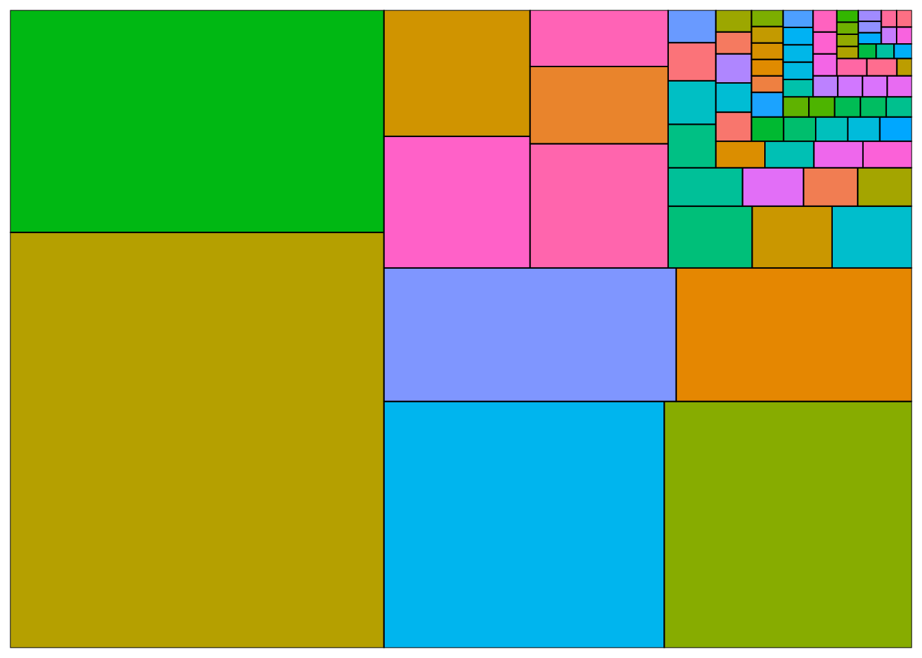
At this step, we just mapped, each area with the number of interactions of a character and filled the area with the character.
Next step, let’s annotate each area with the name of the matching character using the function geom_treemap_text of treemapify package.
This function takes several arguments especially:
familyfor the font familyfontfacefor the font facecolourfor the font color
placefor the place inside the box where the text is placed.growwhich is is very important, because ifTRUE, the text will be grown as well as shrunk to fill the box.
characters %>%
  # Add in the mapping, label
  ggplot(aes(fill = char,area = n,label = glue::glue(" {char} \n ({n})"))) +
  geom_treemap(color = "black", size = 1) +
  geom_treemap_text(family = "Lato Black",fontface = "italic",
                    colour = "white", place = "centre",
                    grow = TRUE) +
theme(legend.position = "none") 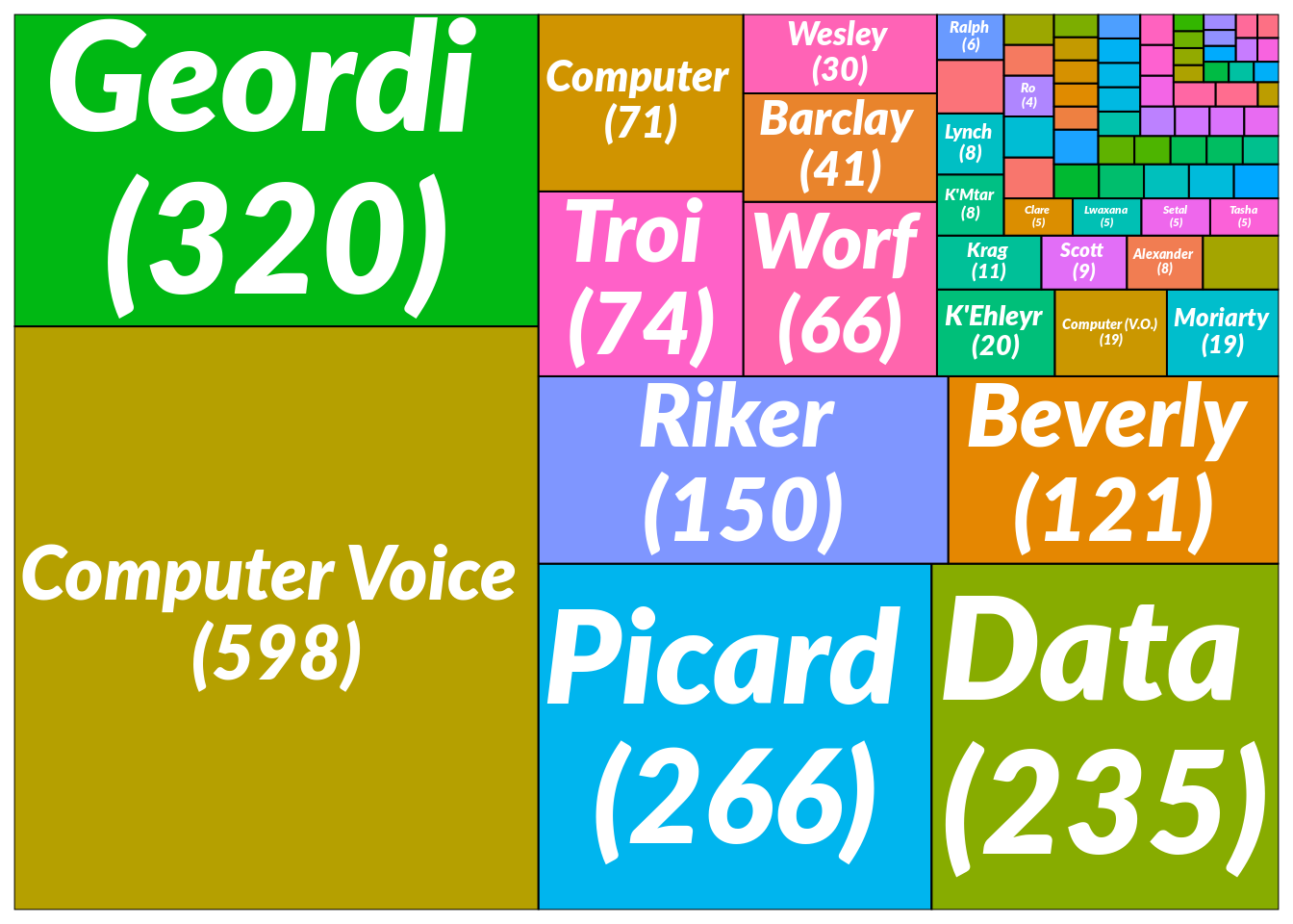
It began to look pretty good, but let’s customize it a little bit.
For that, I will fill the areas with a different color palette. The challenge would be to find a color palette with more 25 colors.
Fortunately for us, colorRampPalette() R function provide a tools to interpolate a set of given colors to create new color palettes.
Cédric Scherer published a trick about that.
Some hands-on example code and plots for this #rstats #ggplot2 trick https://t.co/z1gWTeHN0B pic.twitter.com/6HImKV7vR3
— Cédric Scherer 🦣 (CedScherer?)(vis.social?) ((CedScherer?)) August 13, 2021
Let’s use it. For color palette, I choose Prism from rcartoclor package. We can also access this palette within paletteer package.
paletteer_d("rcartocolor::Prism",12) %>%
  # We visualize the colors with show_col from scales pkg
  scales::show_col()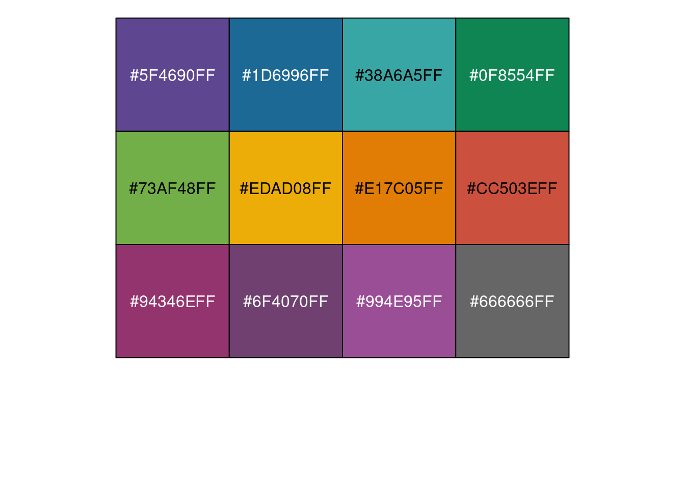
Now, we extend it.
extended_palette <- colorRampPalette(paletteer_d("rcartocolor::Prism",12))
# Let's visualize 49 interpolated colors et
extended_palette(49) %>%
  scales::show_col(cex_label = .55, ncol = 7)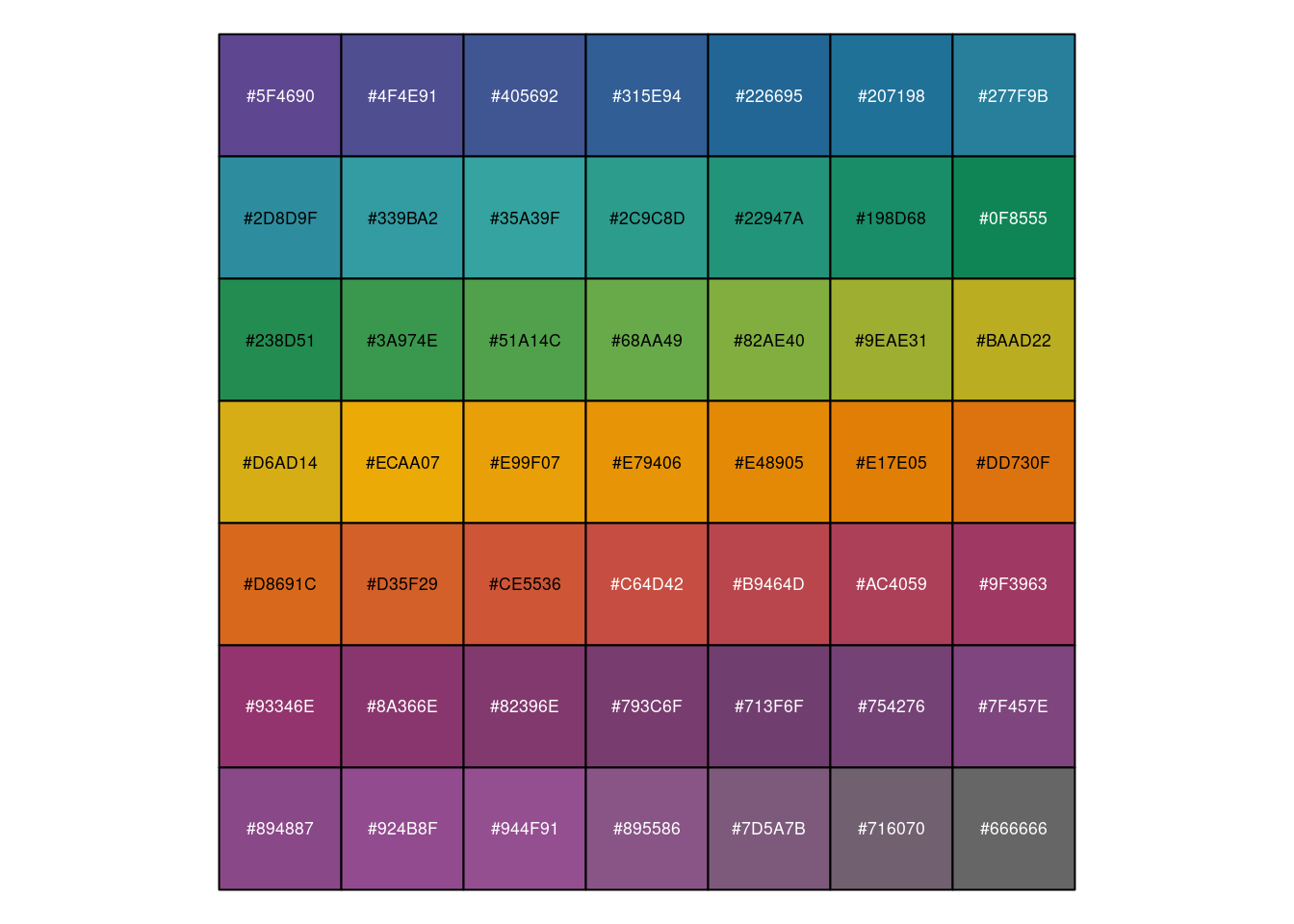
Finally we can use it, and set a little bit more the theme.
plot <- characters %>%
  ggplot(aes(fill = char,area = n, label = glue::glue(" {char} \n ({n})"))) +
  geom_treemap(color = "black", size = 1) +
  geom_treemap_text(family = "Lato Black",fontface = "italic", colour = "white", place = "centre",
                    grow = TRUE) +
  labs(title = "Which characters interact the most with VUIs\n in the Star Trek Saga?",
       caption = "Data from ***SpeechInteraction.com*** and shared by Sara Stoudt.<br/>
       Tidytuesday Week-34 2021.") +
  scale_fill_manual(values = extended_palette(nrow(characters))) +
  theme(text =element_text(family = "Lato"),
        plot.background = element_rect(fill = "grey95"),
        panel.spacing = unit(2.5, units = "cm"),
        plot.title = element_text(family = "Lato Black",size = rel(2.5), hjust = .5, margin = margin(t = 15,b = 10)),
        plot.caption = element_markdown(color = "black", size = rel(1.2), margin = margin(t = 20,b = 10)),
        legend.position = "none"
  )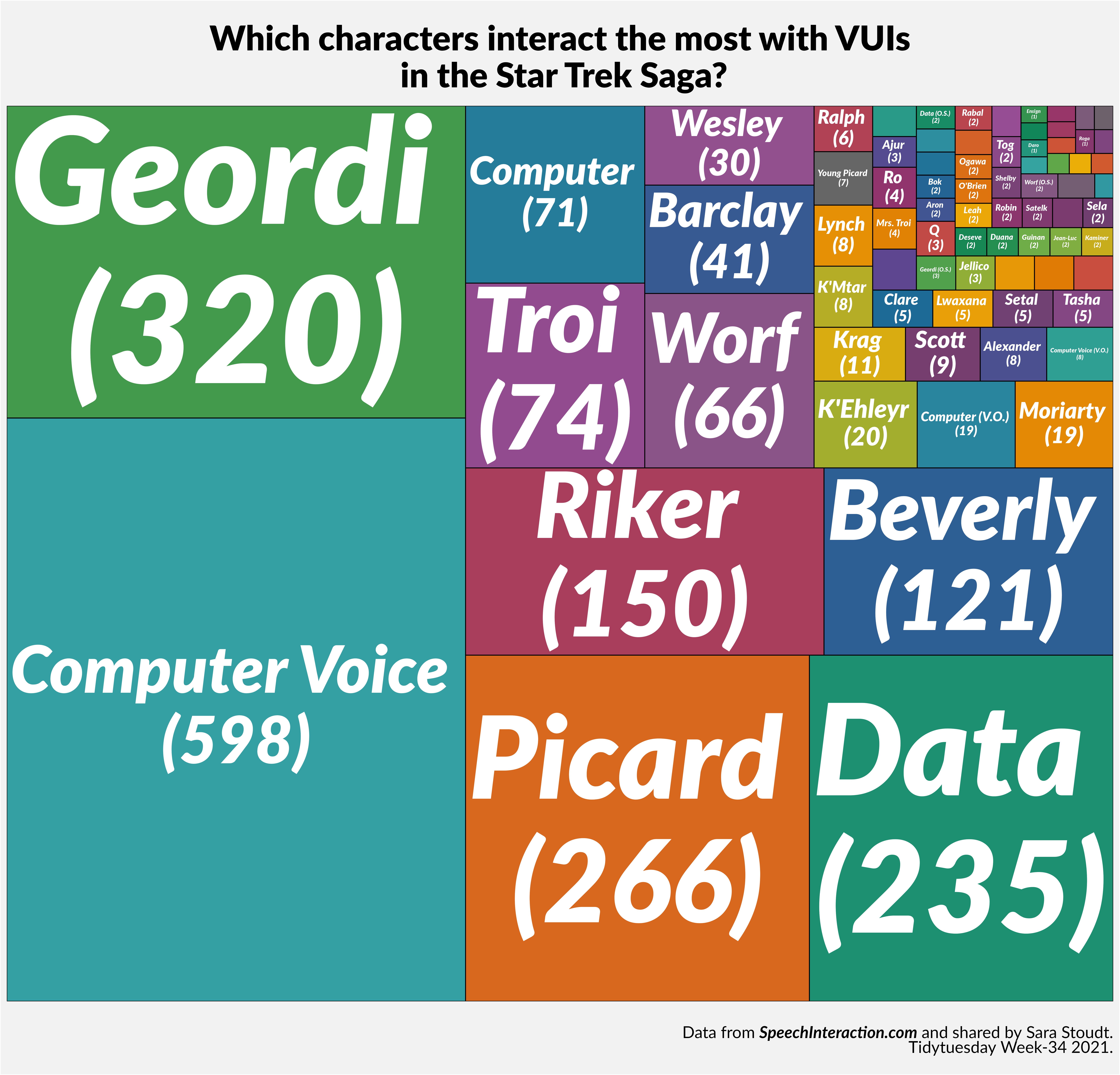
Et voilà!
References
file., See AUTHORS. 2021. Paletteer: Comprehensive Collection of Color Palettes. https://CRAN.R-project.org/package=paletteer.
Mock, Thomas. 2021. “Tidy Tuesday: A Weekly Data Project Aimed at the r Ecosystem.” https://github.com/rfordatascience/tidytuesday.
Rahlf, Thomas. 2017. Data Visualisation with r 100 Examples.
Wilkins, David. 2021. Treemapify: Draw Treemaps in ’Ggplot2’. https://CRAN.R-project.org/package=treemapify.
Citation
BibTeX citation:
@online{issabida2021,
  author = {Abdoul ISSA BIDA},
  title = {Tired of {Pie} {Charts\,!?} {Let’s} Make a {Tree} {Map.}},
  date = {2021-08-17},
  url = {https://www.abdoulblog.com},
  langid = {en}
}
For attribution, please cite this work as:
Abdoul ISSA BIDA. 2021. “Tired of Pie Charts !? Let’s Make a Tree
Map.” August 17, 2021. https://www.abdoulblog.com.